1808 Seltzer
For this label design, 1808 isn’t just a date, it’s a constraint. A lens. What would this brand look like if it actually existed then?
This leads to a visual vocabulary pulled from:
Folk carvings
Apothecary marks
Tavern signage
Agricultural symbols
Hand-inked marginalia
Then simplified, flattened, and stylized into something that feels both historic and immediate.
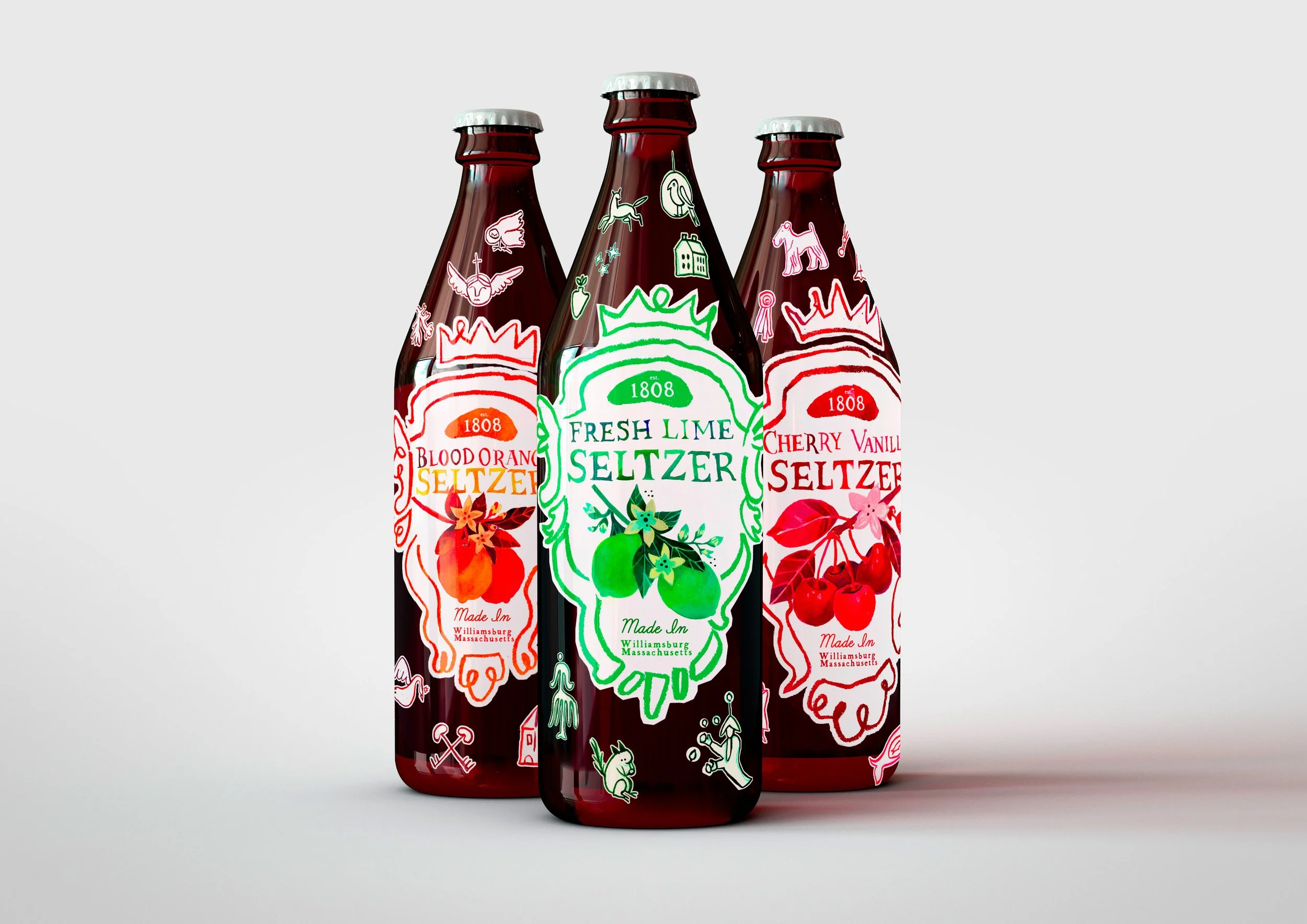

I built a modular illustration library, rather than illustrating three entirely separate labels.
Birds, animals, tools, homes, flora
Each is drawn and painted in a consistent line language
Each can repeat, remix, and scale across media
These “icons” wrap the bottles like artifacts, small clues that suggest a larger world beyond the glass.
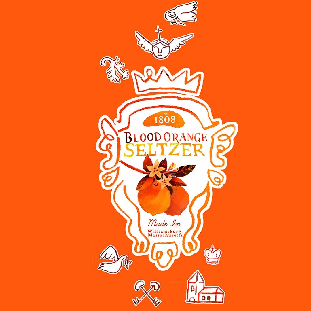
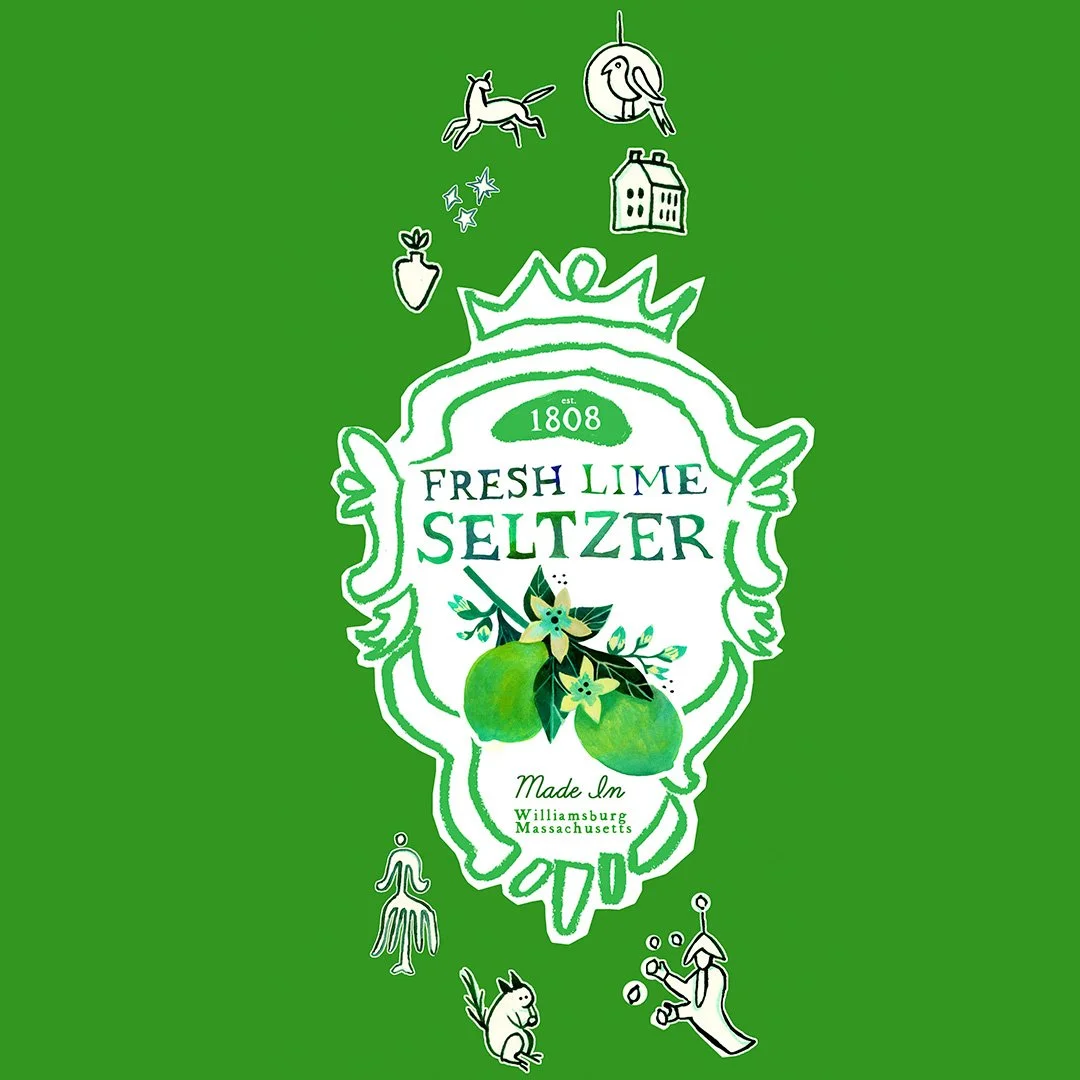

Outcome: Every flavor feels distinct, but undeniably part of the same place.
This isn’t just a set of labels. It’s:
A brand language
A repeatable system
A world that can expand into packaging, merch, environments, and storytelling
When you build the world first, the brand always has somewhere to go.